What is a brand kit? Examples, and a checklist of what goes in one
A brand kit keeps your logos, colors, fonts and approved words in one place. See four examples and a checklist of what goes in one.
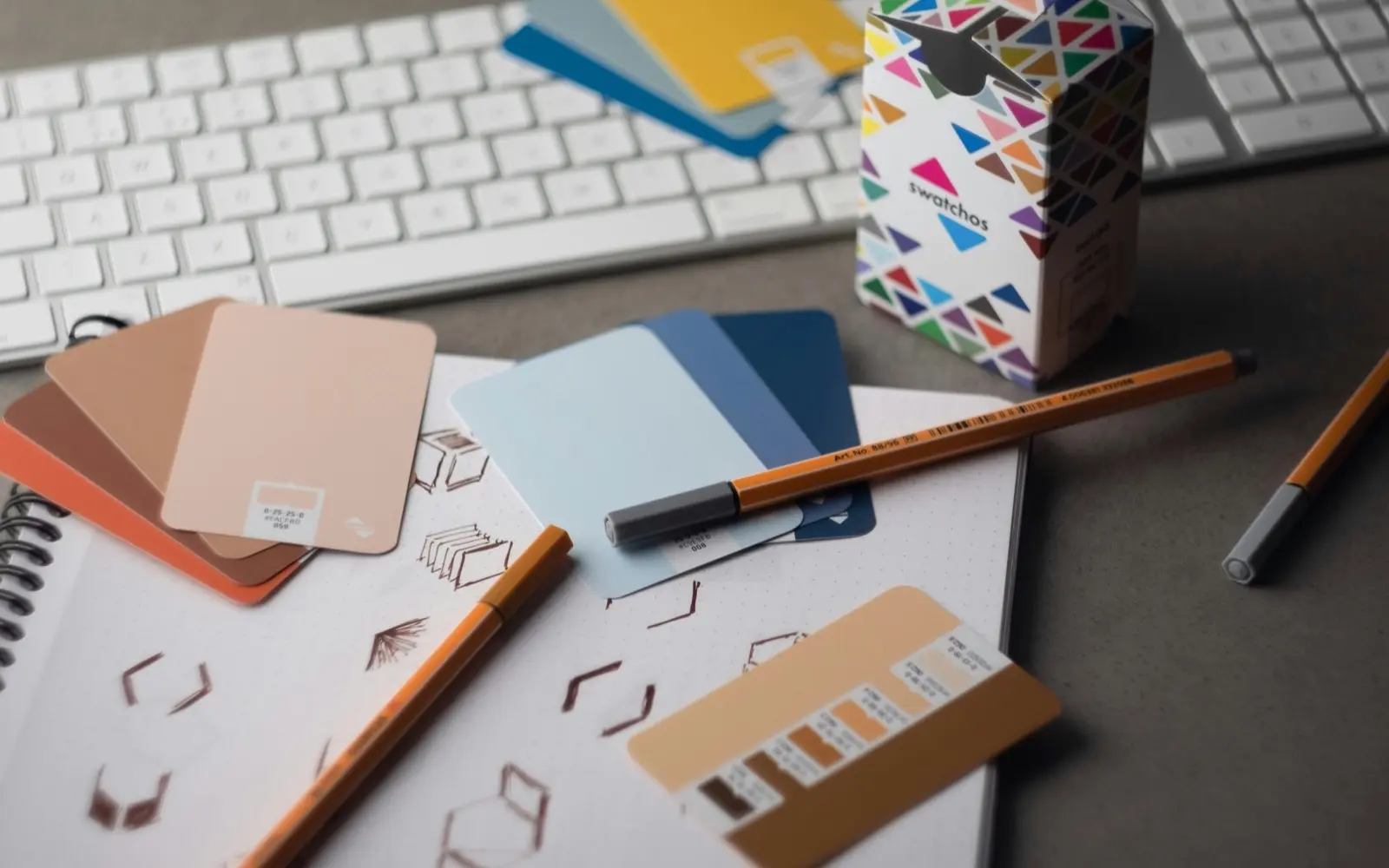
A brand kit is the set of files and facts that make a brand recognizable, kept in one place so anyone can use them correctly. At the very least, that's your logo in every version, your colors with their exact codes, your fonts, and the words you've already approved: a tagline, a short bio, a longer description. A good brand kit answers the questions people ask you over and over ("Do you have a logo with a transparent background?" "What's your green?") before they have to ask.
Below you'll find what a brand kit is (and isn't), a checklist of what goes in one, four example kits, and how to make your own in an afternoon.
What is a brand kit, exactly?
Think of a brand kit as your brand's toolbox. It holds the actual pieces someone needs to make something that looks and sounds like you: a poster, a social post, a sponsor slide, a newsletter, a sign over the door.
It's different from two things it often gets confused with:
- A logo is one piece of the kit. A kit has the logo in every shape and format, plus everything that surrounds it.
- Brand guidelines are the rulebook: why the brand looks the way it does, and how to use it. A kit is what you hand over so people can follow the rules without reading 40 pages first. (There's a longer explainer in brand guidelines, style guide or brand kit.)
Most small brands only need the kit, with a few rules written next to the files they apply to.
What goes in a brand kit? The checklist
Here's everything a complete brand kit holds. You don't need all of it on day one. Start with the first four rows and add the rest as people ask for them.
| What | What to include | Who asks for it |
|---|---|---|
| Logos | Every version (full, stacked, icon), in color, black and white, each as SVG and PNG | Printers, partners, event organizers, your web person |
| Colors | Each color's name, with HEX and RGB for screens, and CMYK or Pantone for print | Designers, printers, anyone making slides |
| Fonts | Heading and body typefaces, where to get them, and a free fallback | Designers, your web developer |
| Approved words | Tagline, a one-line bio, a short bio, a long description, your boilerplate | Journalists, podcast hosts, partners, your own team |
| Voice | Three to five words for how you sound, with a line or two of do and don't | Whoever writes your posts, emails and ads |
| Photos | A handful of approved photos: product, place, people, headshots | Press, partners, event pages |
| Contact and links | Website, social handles, press contact, booking or wholesale links | Everyone, constantly |
| Visual direction | A mood board showing the feeling behind it all | New designers, photographers, collaborators |
Logos: every version, every format
This is the part people need most and find least. Include:
- Each version: your main logo, a stacked or compact version, an icon or mark on its own, and a wordmark if you have one.
- Each color treatment: full color, all black, and all white (for dark backgrounds).
- Each format: SVG for anything that needs to scale, PNG with a transparent background for everyday use, and the original source file (AI, EPS or PDF) for designers and printers.
Name each file by what it's for, not by when it was finished. "fern-field-logo-stacked-white.png" tells people where it goes. "logo_FINAL_v7.png" tells them you had a long week. Our guide to logo file formats covers which file goes where.
Colors: names and codes
Write each color down with its name and every code someone might need: HEX for websites, RGB for screens, CMYK for print, and a Pantone match if you print merch or packaging. Colors shift between screen and paper, so the print codes matter more than people think. Our color converter gives you all four from one HEX code, and this post explains why your green might look different on a business card.
Fonts: what they are and where to get them
Name your heading and body typefaces, link to where they can be downloaded or bought, and note the license. Add a free fallback (a Google font that looks close) for people who can't install yours, like a partner making a slide in a hurry.
Approved words: write them once
The most-asked-for words in any brand are the shortest. Keep these written and approved, so nobody has to improvise:
- Tagline: your line in a few words.
- One-line bio: for social profiles and event listings.
- Short bio: two or three sentences, for podcast intros and partner pages.
- Long description: a paragraph or two, for your website and press.
- Boilerplate: the standard "About us" paragraph at the end of a press release. (Here's how to write one, with 12 examples.)
Voice: how you sound
Three to five words that describe how you write, with an example of each. "Warm, not gushing." "Clear, never clipped." It helps anyone writing for you sound like you on the first try. See 10 tone of voice examples for ideas.
Photos, contact details and visual direction
Add a few approved photos so nobody grabs a blurry one off your Instagram, and put your website, socials and press contact in one place. If you have a mood board from when the brand was made, keep it: it explains the feeling behind the choices better than any rule.
Brand kit examples
Here are four example brand kits. The brands are made up, but the kits are the kind real small brands use.
Fern & Field: a one-person flower studio
Fern & Field grows seasonal flowers for weddings and gatherings. Its owner gets asked for the logo by every venue and planner she works with.
- Logos: a serif wordmark, a stacked version, and a small fern mark for stickers and social avatars, each in Moss and in white.
- Colors: Moss
#5B6B3F, Forest#2E3A2A, Wheat#C9A66B, Parchment#EFE6D6and Clay#8A4F3D. - Fonts: Fraunces for headings, Avenir Next for everything else.
- Voice: romantic, grounded, unhurried.
- Tagline: "Flowers for slow, joyful days."
- Extras: two sub-brands (Field Workshops and Field Notes Journal), each with its own palette tweak, and a press contact for wedding magazines.
Northline Coffee: a roaster with two cafés and a wholesale line
Northline sells beans to cafés and grocers, so its kit gets sent to buyers as often as to designers.
- Logos: an all-caps wordmark and a round badge for bags and cups.
- Colors: Harbor Navy
#22303F, Copper#B4693C, Oat#E9DFCF, Espresso#3B2A22and Fog#C9CFD2. - Fonts: Avenir Next for headings, Fraunces for body text, which gives the menus their warmth.
- Voice: warm, textured, quietly confident.
- Extras: a two-page wholesale sheet, photos of the roastery, and a separate kit for Northline Wholesale.
Harbor Health: three clinics, one calm voice
Harbor Health runs neighborhood clinics, and its kit keeps three locations from drifting apart.
- Logos: a main logo, plus a version for each clinic: Harbor Eastside, Harbor Westside and Harbor Kids.
- Colors: Tide
#2F6F7A, Sand#E8DCC4, Sea Glass#9CC7C1, Ink#1C2B33, and Coral#E07A5Fused sparingly for buttons. - Fonts: Avenir Next for everything, for clarity.
- Voice: calm, clear, kind.
- Extras: approved wording for appointment reminders, and a media contact for health reporters.
Studio Afterglow: a photographer's kit
Studio Afterglow photographs musicians and makers, and its kit mostly goes to clients who want to credit the studio properly.
- Logos: an italic wordmark and a simple "A" mark for watermarks.
- Colors: Sunset
#F08A4B, Lilac#B9A4E0, Lagoon#2F8F8B, Butter#FFE8B8and Plum#4A2545. - Fonts: Fraunces Italic for headings, Avenir Next for body text.
- Voice: expressive, nostalgic, full of color.
- Extras: a photo credit line to copy, a portfolio link, and a mood board that explains the studio's look better than words do.
Notice what they have in common: none of these is long. Each kit fits on a page or two. What makes them useful is that everything is in one place, labeled, and current.
Who needs a brand kit?
Anyone whose brand gets used by more than one person. In practice:
- Founders and small business owners get asked for their logo, colors and bio by printers, venues, podcasts, partners and press. A kit means you answer once.
- Freelance designers hand one over at the end of every branding project. It's the difference between a client who can use their new brand and one who emails you for the logo every month.
- Agencies and studios keep a kit for every client so nobody uses last year's colors on this year's campaign.
- Marketing teams use one so the sales deck, the website and the event booth all match.
How to make a brand kit
You can put together a working brand kit in an afternoon. Here's the order that saves the most time.
- Gather everything. Search your email for "logo", check your shared drives, and dig out whatever your designer sent. Put it all in one folder, mess included.
- Find the real final logo. Group the versions of each logo, keep the newest and sharpest, and delete or archive the rest. If you only have a JPEG, here's what you can do.
- Write down your color codes. If you only have HEX codes, convert them for print with the color converter.
- Name your fonts and note where to get them.
- Write your words once: tagline, bios, boilerplate, and a few voice words.
- Put it where people can reach it. A shared folder works. A one-page PDF works. A brand kit app works best if you share your brand often or look after more than one.
That last step is why we built BrandTab. You can start a brand by handing it your website or a messy logo folder. Tabitha, BrandTab's assistant, reads the site for your logo, palette, fonts and copy, or sorts the folder: she groups versions of the same logo, picks the newest, sharpest one, and builds a palette from the logos' colors. You review everything before it's saved. Your first brand is free.
Once it's in, you can copy any color, bio or link with ⌘K on Mac or Ctrl+K on Windows, or from the menu bar with BrandTab for Mac. On Creative and Studio plans you can share the whole kit as one link, or turn it into a press kit, speaker kit or one of five other media kits.
What makes a brand kit actually get used
The kits that get used, rather than filed away, have four things in common.
- One place, one link. If people have to ask which folder, they'll grab a logo off your website instead.
- Labeled by use. "For dark backgrounds" helps more than "white_v2".
- Kept current. When the bio changes, the kit changes the same day. Old PDFs in inboxes are how outdated logos end up on billboards.
- Easy to copy from. People need a hex code or a bio pasted into something else, right now. The faster that is, the more they'll use the real one.
Questions people ask
What's the difference between a brand kit and a logo?
A logo is one mark. A brand kit includes the logo in every version and format, plus your colors, fonts, approved words, photos and contact details, so someone can make anything on-brand without asking you.
What should a small business brand kit include?
Start with four things: your logo in color, black and white (as SVG and PNG), your colors with HEX and print codes, your font names, and a short bio. Add photos, a boilerplate and voice notes as people ask for them.
Can I make a brand kit for free?
Yes. A shared folder plus a one-page document is a perfectly good brand kit. If you'd like a tidier home for it, BrandTab's Free plan holds one whole brand, with every section, at no cost.
What format should a brand kit be?
Whatever your people can open. A PDF is easy to send but goes out of date the moment something changes. A shared folder stays current but can get messy. A link to a brand page stays current and is easy to send, which is why more brands use one.
How often should you update a brand kit?
Whenever something in it changes, and a quick check once a year. Our end-of-year brand audit is a good excuse to do it.